Case Study I
CHELSEA APARTMENT
INTRODUCTION
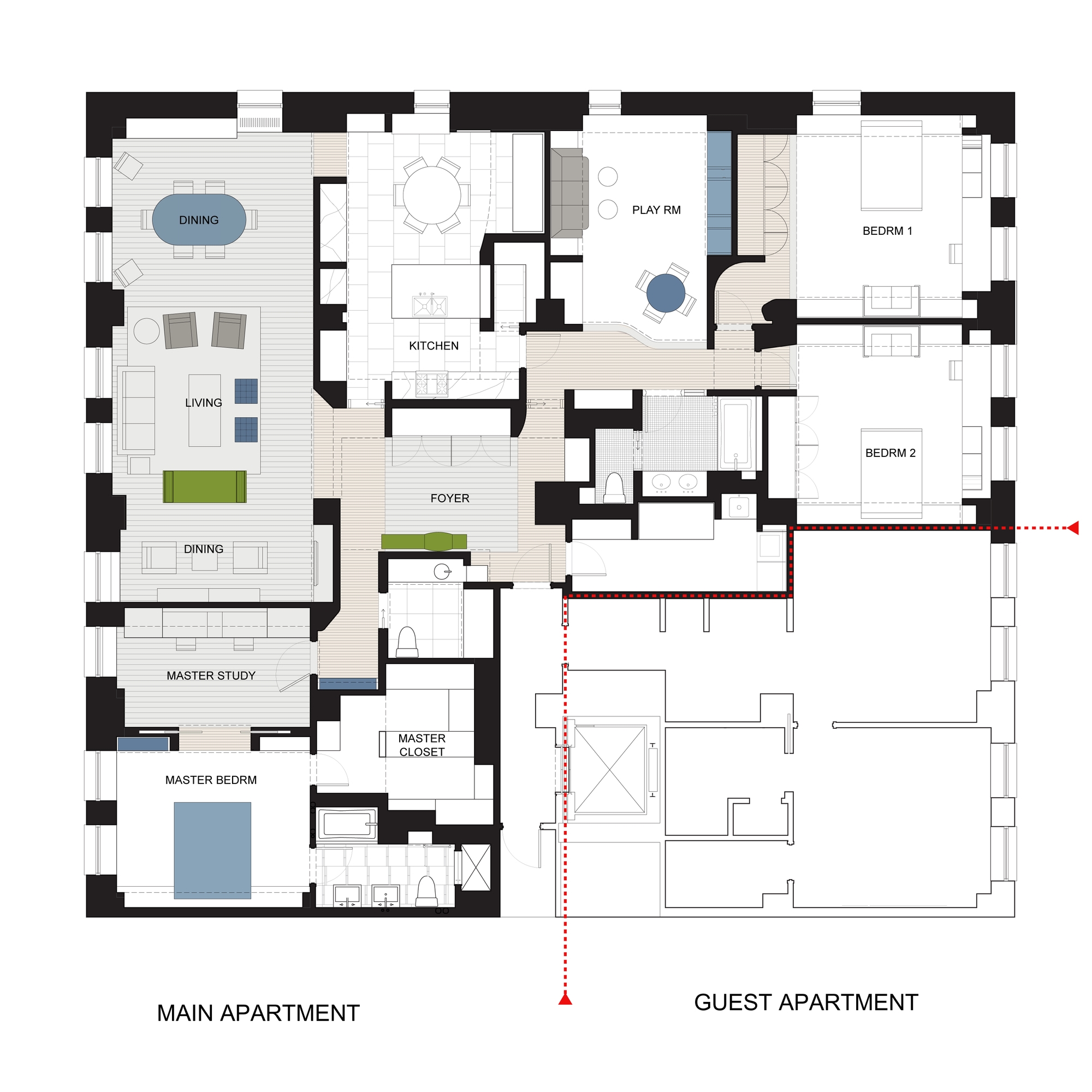
Chelsea residence is a 3,200 square foot apartment that combined two 2,000 square foot lofts in a prewar building on West 17th street in Manhattan. One remaining 800 sq. foot apartment is next door as an extra dwelling.
FROM 2000+2000 TO 3200 + 800
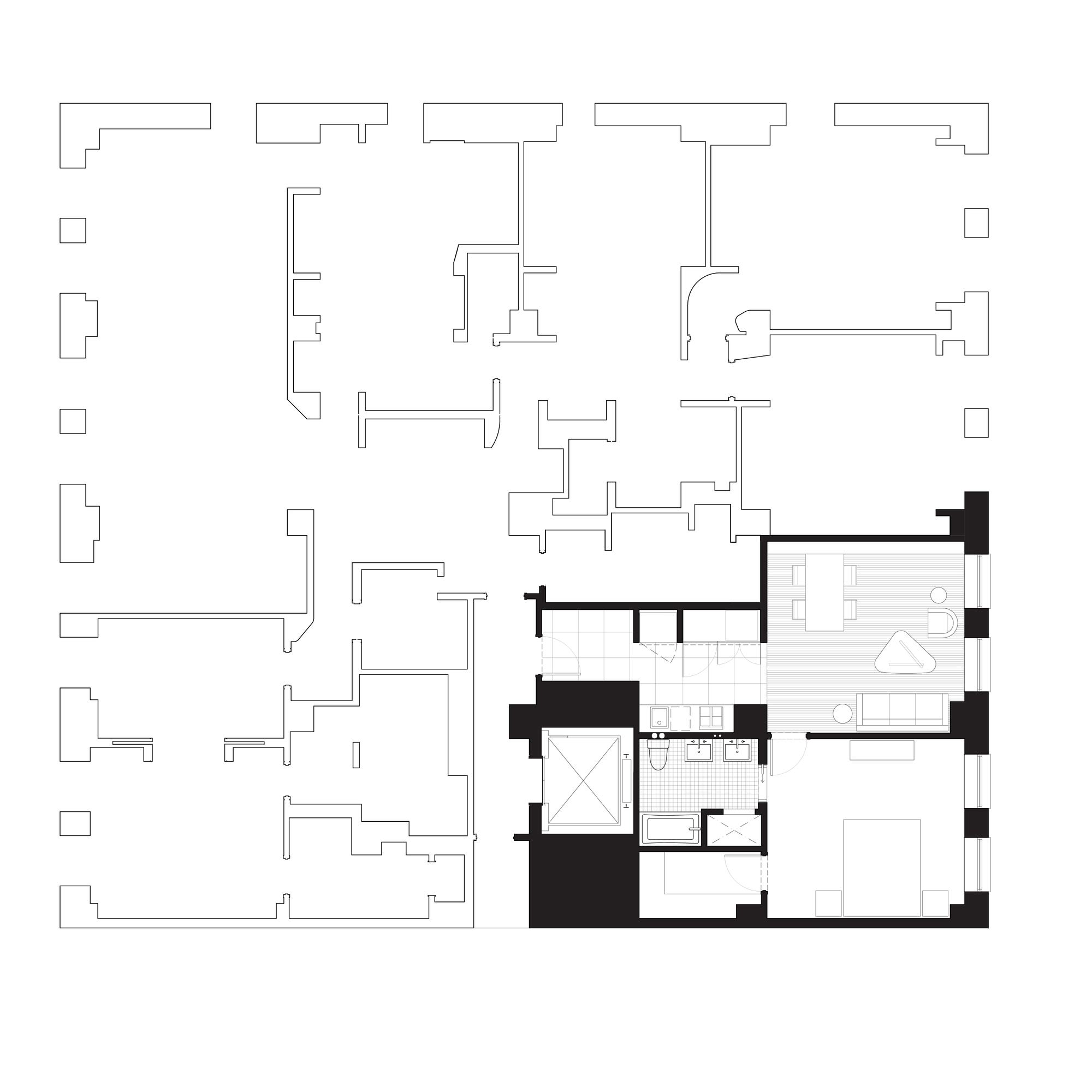
EXISTING FLOOR PLAN
The original plans had back to back open kitchens with large living areas and smaller bedrooms. The space is well lit with natural light coming mainly in the afternoon through southern window.
Spacial configuration
THE COUPLE desired to have space for their two young boys and ample room for entertainment. After many years of traveling for work, they also accumulated a unique collection of art and artifacts that needs each individual unique situation, and display.
THE TWO APARTMENTS, owned by the couple, is occupied in one and rented in the other. As the wife's career in fashion grow, the home needed additional space for work and storage.
".... decorated in cool and warm color
with display of school artwork and
books, while the playroom allows for fun activities."
THE NEW LAYOUT has an entry foyer at the very center of the apartment to connect the wings on both sides. To the right, we have the children's playroom, followed by their bedrooms.
To the left, you enter directly to the living room area with the new kitchen to the right, divided by a free standing cabinet. The Powder room is conveniently located next to the foyer. The enlarged kitchen consists of an additional breakfast table and a separate pantry. Enlarged public space has multiple functions; one side to serve as living room with adjacent small TV area and the dining table on the other. The shelving behind the dining table acts as the backdrop and the low chandelier anchors the room.
Within couple steps, you enter the Master Bedroom suite. Upon entering,there is a large study with two desks for the couple, this acts as a transitional space for the flow of the pace, and a preparation prior entering the bedroom. With pocket doors, we provide privacy as well as providing the ability to enlarge the bedroom when desired. The lift up desk tops is custom made to hide all work area within an instant. Large bathroom with two vanities and double height dressing room complement the suite.
The children’s bedroom are anchored by a mutual playroom and a shared bathroom. Each bedroom has a custom build in desk and beds with pull out beds for guests. The quarters are decorated in cool and warm color schemes with ample room for display of school artwork and books. The playroom allows for fun activities with shelving designed for display of family photos.To add a little bit of playfulness and fun, the Noguchi Cyclone Table with Custom Top is introduced to the apartments' two other members, the family cats..
The main apartment is now 1.5x bigger than what it was..
Despite the reduction of square footage, the guest apartment can fully functioning and efficient.
FLOOR FINISHes.
Floor materials are conceived in terms of activities and building requirement of wet over dry and quiet versus noisy areas. All bedrooms received padding and wool carpet; bathrooms and kitchen have waterproofing membrane with various stone surfaces.
Public areas are conceived in fumed white oak. Main circulation space are defined with narrow 2" planks and lower soffit, this provides a sense of intensity through the proportions of body in relation to surrounding space. Other areas meant for gathering and lounging have 6" planks and higher ceiling, to provide one with a sense of greater scale of the room, hence smaller body.


